Creating a Cohesive Color Palette for On-Set Photography Styling
When styling a photoshoot, every detail matters—but few elements are as impactful as color. A well-planned palette can bring harmony to a series of images, subtly reinforcing a brand’s identity while guiding the viewer’s eye. Whether styling for a product launch, an interior space, or a lifestyle shoot, selecting a color that complements the subject and carries through every shot ensures a polished and intentional final result.

The Power of a Cohesive Color Story
A thoughtful color palette does more than just look pretty—it creates a visual rhythm that ties images together. In a multi-shot campaign or brand shoot, consistency in color makes the images feel connected, rather than a random assortment of photos. When used well, color can evoke emotion, highlight a product’s features, and elevate the brand’s overall aesthetic.
Choosing the Right Color
The first step in crafting a color story is selecting a base color that enhances the product or subject being photographed. Consider the following factors:
Brand Identity: If the shoot is for a company, what colors already exist in their branding? If the brand leans into warm neutrals, incorporating rich terracottas, caramels, or soft creams may feel more aligned than introducing bold, high-contrast hues.
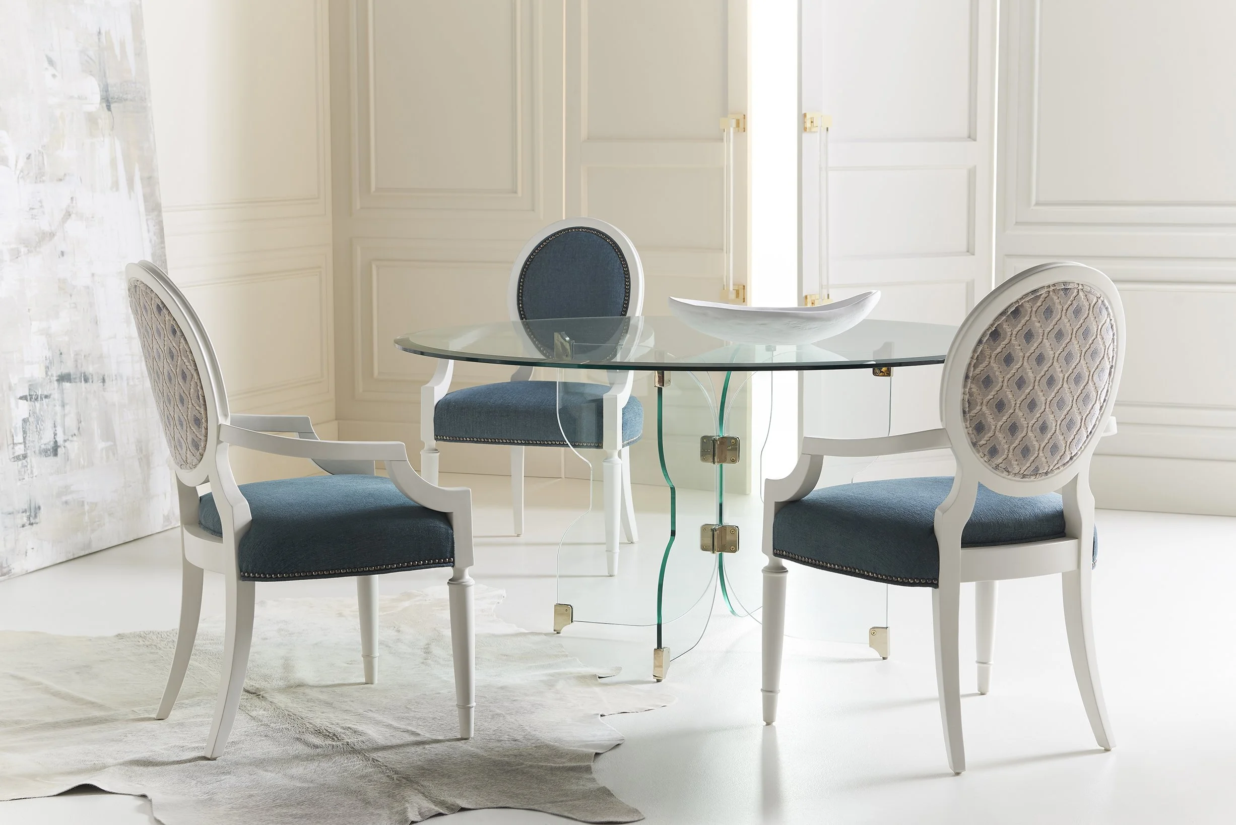
Emotional Impact: Different colors evoke different emotions. Blues feel calm and serene, while yellows bring energy and optimism. Consider what the brand or product is trying to communicate.
Complementary vs. Contrasting: The chosen color should either complement the main subject (a soft sage green enhancing earthy ceramics) or provide just enough contrast to make the product pop (a deep navy backdrop for a crisp white vase).
Repeating Color Throughout the Shoot
Once the hero color is chosen, it should be woven into every shot in subtle ways. This creates continuity and an effortless flow between images. Some easy ways to repeat color include:
Props: A small ceramic bowl, fabric swatch, or stack of books in the chosen hue can appear in multiple shots.
Florals & Natural Elements: Bringing in fresh flowers, greenery, or even food that aligns with the palette adds a natural and organic feel.
Background & Textures: A painted backdrop, styled textiles, or layered surfaces can subtly reinforce the color story.
Wardrobe & Styling Details: If people are part of the shoot, clothing choices should align with the palette—either complementing or subtly contrasting for balance.
Case Study: Bringing Color to Life
For a recent shoot with a wallpaper brand, I selected a pop of ochre to contrast against a muted blue-gray print. To ensure this color carried through each shot, I styled the set with a painted wooden chair, a ceramic dish, and a simple floral arrangement featuring golden hues. The result? A cohesive, elevated story where each image felt connected while maintaining visual interest.


Final Thoughts
Color is one of the most powerful tools in a stylist’s arsenal. When used intentionally, it transforms a set from disjointed to dynamic, creating a seamless, storytelling-driven collection of images. By selecting a thoughtful base color and repeating it through props, textiles, and background elements, you ensure that every shot looks like it belongs—without feeling overly staged or forced.